Today, I’d want to show you how to get vector graphics using an AI. These new AIs are notorious for producing extremely low-resolution results, typically 512 by 512 pixels. That is not beneficial for printing applications, for example, or for creating logos or icons that must be utilized at higher resolutions.
However, with a few methods and entirely free software, you can produce a result like this from a very crude sketch like this in under 30 minutes. So, let’s get started, and have some fun.
Most essential, a working installation of StableDiffusion is required. I have one running locally on my GPU with this web UI, but there are many other choices that might work for you if you don’t have an Nvidia GPU or are working on a Mac.
So, to get that working, simply go to the first link in my description and figure out what works best for you. Next, you’ll need an image alteration application, such as Photoshop, but any other alternative will suffice. We’re going to keep things basic here.
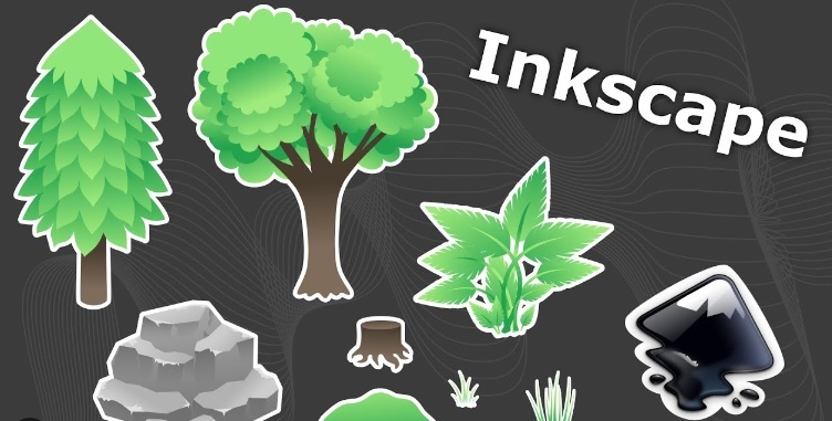
Finally, you will require software such as Inkscape. Inkscape is a free vector manipulation program. You may also use Illustrator; this is acceptable.
The first thing we’re going to do is work in Photoshop. Why? Because I enjoy having complete control over my AI output. So I’m going to use the “image to image” technique, which produces results based on an input image rather than just a word prompt.
What’s critical for vector drawings is that the background is translucent. If you’re going to create an icon or a logo, you don’t want it to have a big black square or just be square, do you? So, using the image-to-image method, I discovered a technique that allows me to easily remove the backdrop at the end. And the way I do it is to give it a very vivid hue, like this purple, that will not exist in your final outcome. If you don’t want this purple in your symbol, just change the color.
And now, using only the paintbrush tool, I’m going to scribble the icon I want in here. Assume I’m designing a logo for a restaurant, such as a lighthouse with some waves. And I suppose I should set my paintbrush to 100% hardness. We don’t want any softness because vector drawings are known for having very straight lines and crisp colors, so I need to increase the hardness. Let’s also make some waves. So, let’s make them blue. You’re already choosing the colors; they’ll be fairly similar in the end outcome, so choose them now. And all I’m going to do is draw some waves.
And now I want a gray rock, so I’m just going to sketch one behind the waves and add some foliage to it, maybe some moss on top. The lighthouse has arrived. I want the lighthouse to look like a classic lighthouse, therefore I’m going to paint it white and red, add stripes, and a small roof with, of course, our yellow light. Nice. So, this appears to be quite infantile; this is not what we want in the end result.
So, let us export this and load it into Stable Diffusion for the next critical step. It’s fine to export it as a JPEG and call it one because we’ll be doing numerous iterations here. 8 is good; we’re not going to need it in the end anyway. And now we’ll go into Stable Diffusion, choose the image-to-image algorithm, and insert your image here.
For this type of work, the prompt is critical. We’re not looking for a photorealistic lighthouse, are we? We need something that works with vectors, and I discovered that vector illustration works nicely in the prompt. Also, the “vector illustration of a lighthouse on a mossy rock in the ocean” is of the highest quality.
 Now, I’ve tried some cross-hatch shading to achieve a lovely illustrated appearance that has sometimes worked for me, so you can leave it in there if you want, and detailed is great. So, for now, sampling steps 20 are fine. The batch count is just the number of images you want in the final result. I have a good GPU; it’s quite quick, so I’ll just go with six. The Cfg scale is fine at seven, and denoising intensity is dependent on how much you desire. Right, this first step is so difficult that I’m going to go quite high.
It can travel pretty far away from what I supplied it here, thus the higher it is, the further you let it to stray from your original image. I’ll set it to 60 and see what happens. Don’t adjust the width or height; this AI was trained on 512×512 photos, and anything larger produces strange results, so don’t bother. You can always upscale later, and we don’t need a high result today, especially with vector drawings. That will come later. So, let’s hit the generate button and watch what occurs.
And here are the outcomes. You can tell it’s already far superior to what we painted. There’s a touch too much information here for my liking, but it clearly grasped what we needed. Isn’t it cool how the lighthouse has those stripes? This one appeals to me. This one is fantastic. That’s a good one. It complements the color scheme. That appeals to me. So, what we’ll do next is replicate the desired results and mix them in Photoshop or something.
I prefer the tower on this one, so I’m going to copy and paste it here. So, I don’t particularly like the top of this now because we have a solid hue and don’t need to do much tricks. We can just choose this background color. It may have changed significantly from the original, but don’t be concerned; simply paint over it. It’s actually that easy. Simply paint over the areas we don’t like. Very simple.
Now, the water isn’t that appealing, so I’m just going to maintain the tower itself. Wonderful. So that’s fantastic. That’s a lot of our image left. And now for this one, I like the pebbles. This is an interesting rock. That one is one of my favorites. So, let us imitate this. Of course, we’ll have to get a little more creative here. I’m going to choose the rock, mask it, and then bring it up here. It’s fine if it doesn’t exactly match. That is perfectly OK. We’ll send it through once more. That’s a nice rock.
Now I’m going to look for a suitable ocean for us. Hmm, I guess it’s in that one, so let’s bring it up again. Let’s just mask that off and add some white. We enjoy our ocean here. Okay. So, I don’t like that it’s leaving the image, and the shadow is a little strange here in the ocean, so I’m going to change it to black and completely erase it. It’s all right. It’s perfectly fine. In any case, it will change in the next step. And the tower I like best is this black one here, so I’ll duplicate that and paste it in here. Mask it in the same way.
Wonderful. Make sure the background is the same color because we don’t want a change because it is sensitive. If we preserved that tile in the different purple, it would still be there in the next AI generation. Okay, that’s really cool.
So it did really remove our mossy rock. That bothers me. I believe there was some mossy rock in here that we could leave. No, not at all. So, let’s only pencil them back in, not totally paint them. Great. It’s already looking far superior to our first illustration. Our original looked like this, so isn’t this an improvement? This will be iteration number two.
Keep in mind our iteration rule. Simply rename it two JPEGs, increase the quality somewhat; we have greater quality now, and import it back in here.
Let’s see whether we need to tweak our prompt a little. Just call it “in the ocean waves.” Put the word “wave” on an island. Call it “an island with mossy rocks in the ocean waves.” Now you must verify your settings to determine if the parentheses had any effect. So it’s someplace about here. Yes, utilize text in parenthesis to draw the model’s attention to the text. That’s exactly what we want. Put something in right-angle parentheses if you want to pay less attention to it.
I’m not sure what to call them.
And now you can increase the sampling steps somewhat to give it more work to accomplish. And perhaps we don’t need as many gradients? There’s no true gradient here, but it’s becoming a little smoother. Let’s try adding some explicit lines to that prompt and see what happens. Denoising strength may be reduced slightly because we are getting near to the desired output. Let’s leave the rest alone and click create.
Let’s get started. Okay, it did result in the mossy rocks. The waves are becoming erratic. That appeals to me. That’s really cool. It’s starting to seem a little gradient-y.
This adds a lot of colors, but it could still be made into a vector. That’s a pretty good one. That island appeals to me. That one is entertaining. So we may truly choose our favorites here. So, this is a fantastic one with the rock, almost like a lighthouse stuck in there. That appeals to me. So, let’s start with this one. The majority of the lighthouse appeals to me as well. I’m not sure what to make of the addition of a drop shadow here. But if I choose a wave I like, that one’s very nice. It’s as if something is breaking on there. Actually, I have a soft spot for that island. Actually, I prefer this entirely, so that’s fine.
And now all I want is my yellow back. So the lighthouse’s golden top remains my fave. So, let’s go with it. It’s the most obvious; it makes perfect sense as a vector. So let’s mask that one and make sure the color stays consistent. Let’s get started. All I have to do now is remove this shadow here, and we’re ready to convert this to a vector. So, export this one last time in Photoshop or at a high quality. Let’s use PNG this time, call it something like “export to vector,” save it, and then bring it into Inkscape.
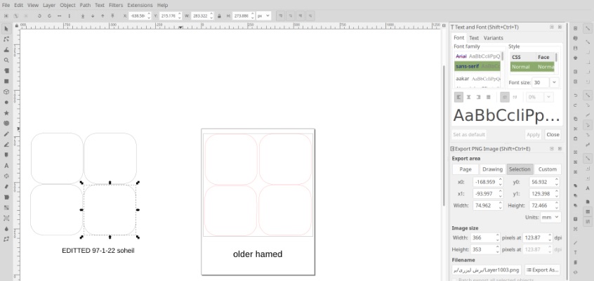
So, what we need to do here is import our image and convert it to vector form. We do this by clicking file, import, and then selecting our “export to vector” PNG, which we can now change to whatever we want. It’s not that significant. I’m going to be smooth. The PC is sufficiently fast. Embed, make sure it’s not connected because if the photo is absent in the original folder, it’ll be lost here as well, and then click OK.
And now we begin. The feature we require is now available under path, trace bitmap. Because this is a bitmap, to summarize briefly, a bitmap is an image with individual pixels, correct?
It depicts the image in terms of pixel colors, and vectors, right? Curves and colors are used to describe it. So we’ll trace the bitmap to create a vector drawing. This is what i got it to look like after these steps, www.daprompts.com/prompt/ethno-girl-large-collection-african-artifacts-accessories-royalty-free.html
We click here, and a menu appears over here, from which we must select multicolor detection mode colors, and you can see it’s already working. So you can turn up the scans based on how much information you want, right? We have a few details in that rock, therefore it’s approximately 15. It doesn’t appear to be getting any better, which is a positive sign. You can simply click smooth to ensure that there are no odd corners.
Also, experiment with these settings. You can also click apply and wait to see what occurs, being careful to conceal the image in the background to check whether you got a good outcome. Yes, there is some strangeness here.
As a result, you should experiment with the settings. There’s a transparent portion there that I don’t like, so just fool about with it, undo it, and we get a cool result. So I hidden the original image; you can even erase it if you don’t want it to feed back into this.
And now you can easily delete the backdrop because it’s just one giant lump of color, right? So double-click to check which path it is, hide it, and it’s gone. Of course, if this is for a professional purpose, it will need to be cleaned up a bit. Isn’t there anything strange going on here? You can either erase these sections or try to trace the bitmap more cleanly.
Finally, you can choose this, export, and set it to a normal SVG or an escape, as needed, and you’ll have your output. I’m sure you can think of a lot better application for your new vector graphic than I did in this example. But the idea is that you now have a file that you can print anyplace, on a little sign, a large sign, or even on t-shirts. You may give it to a corporation if you developed their logo, which opens up a whole new realm for AI results that were previously notoriously low quality. So I hope you find this strategy useful.